

Bringing Sustainability into Focus
The design of this sustainability report turns two years of initiatives, performance data, and future goals into a cohesive editorial experience.
The challenge was to make substantial technical content feel clear, engaging, and easy to navigate while preserving the precision of corporate reporting.
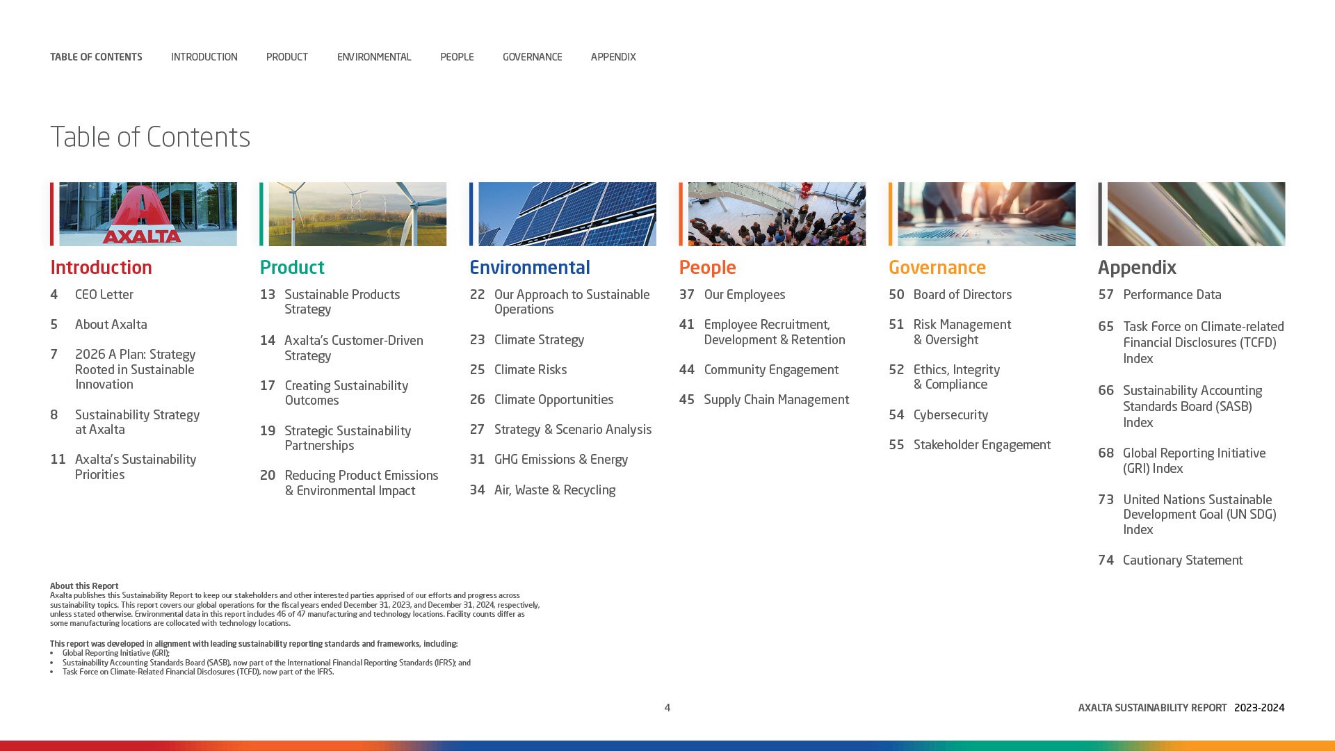
A structured grid, clear typographic hierarchy, and considered spacing establish a consistent rhythm throughout the publication. Color-coded sections distinguish key topics and help readers move between narrative content, performance metrics, and detailed disclosures.
Color with Purpose
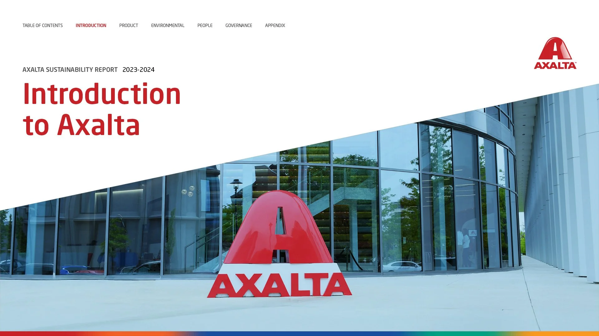
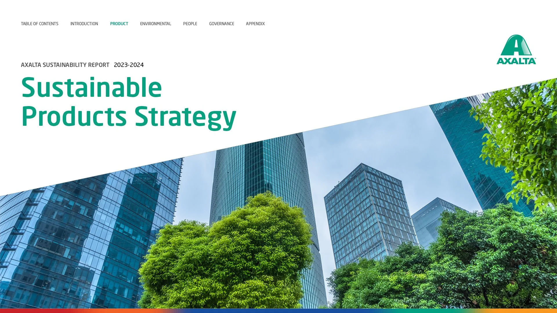
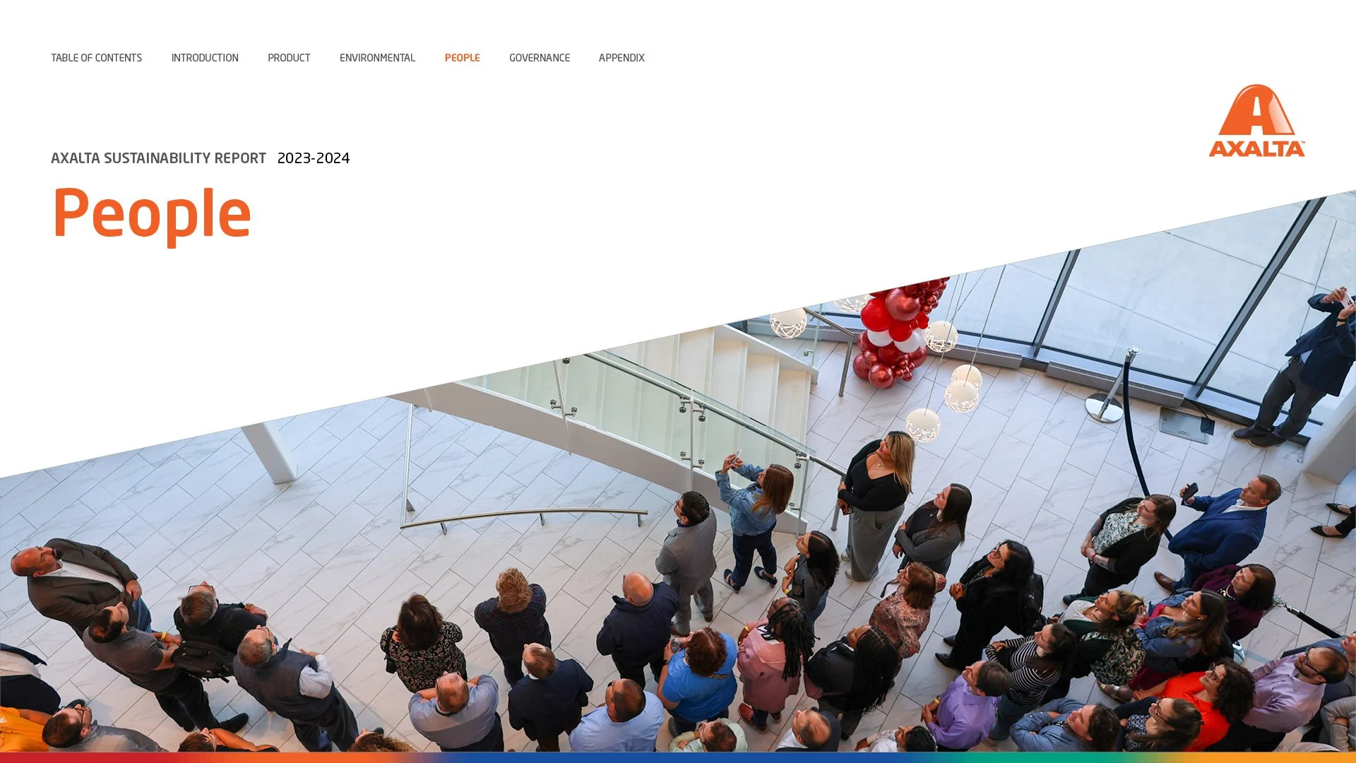
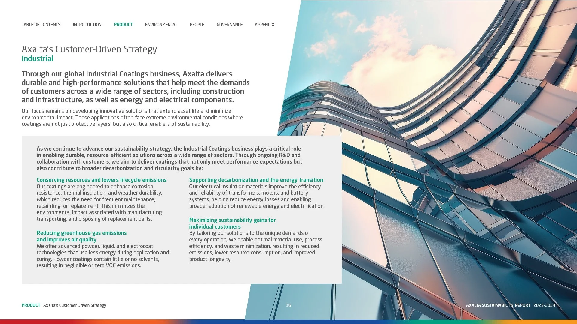
Color gives each business segment a distinct visual identity within the report’s broader design system. Applied consistently across section openers, headings, charts, and graphic accents, each palette helps readers recognize where they are and connect related content. This approach adds variety to the publication while keeping the overall experience cohesive, turning color into both a storytelling element and a practical navigation tool.
Clarity Through Visual Storytelling
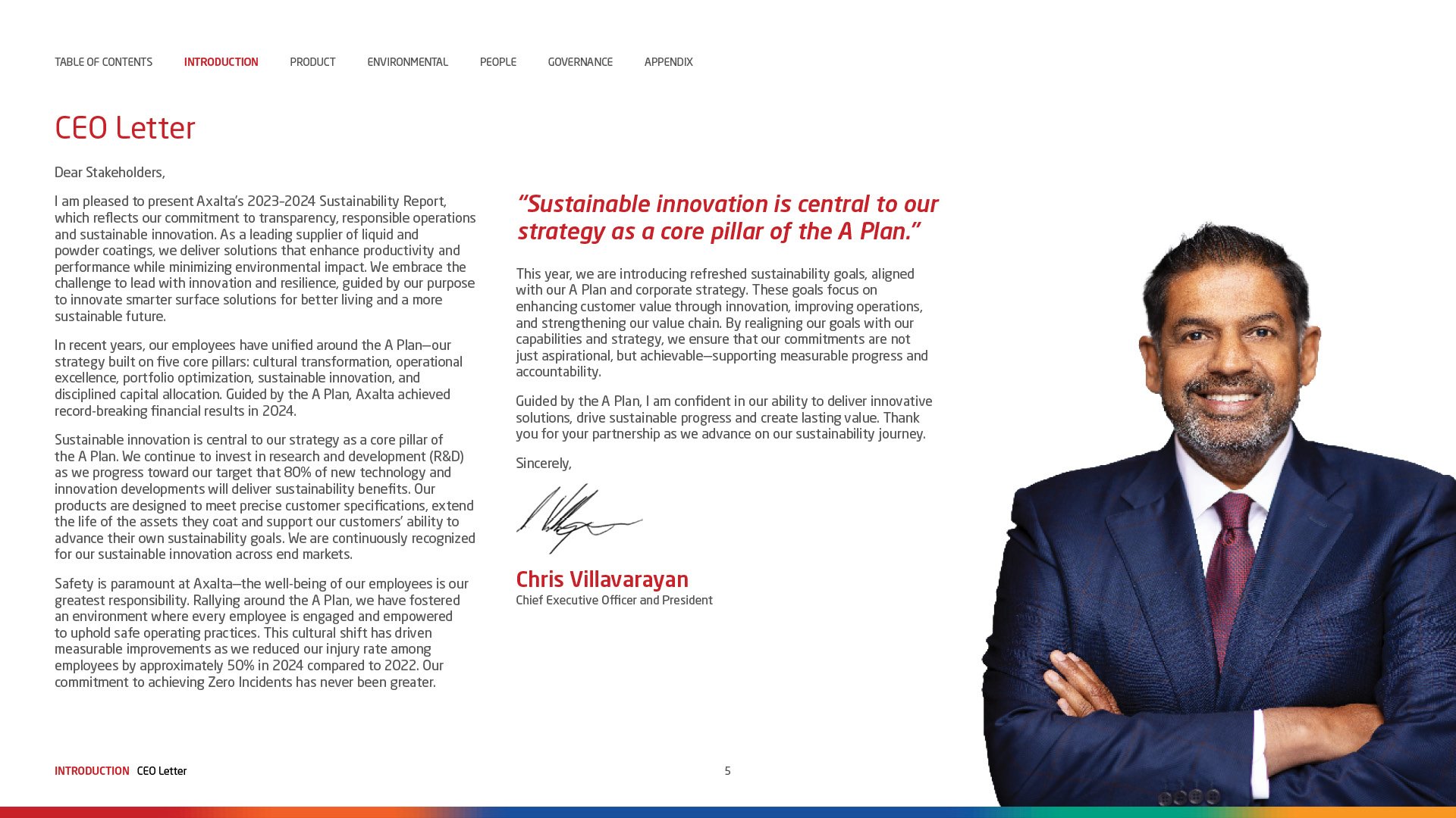
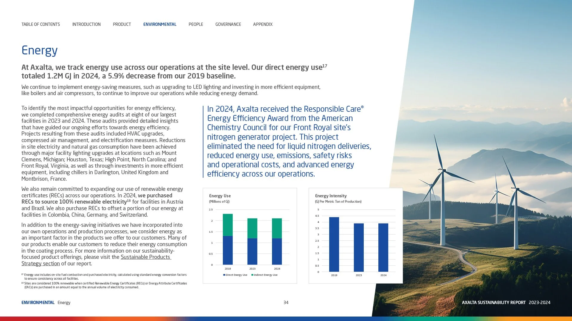
Photography connects the sustainability story to the people, products, and places behind it. Angular image panels on the cover establish a visual language that carries through the report, bringing energy and continuity to the design.
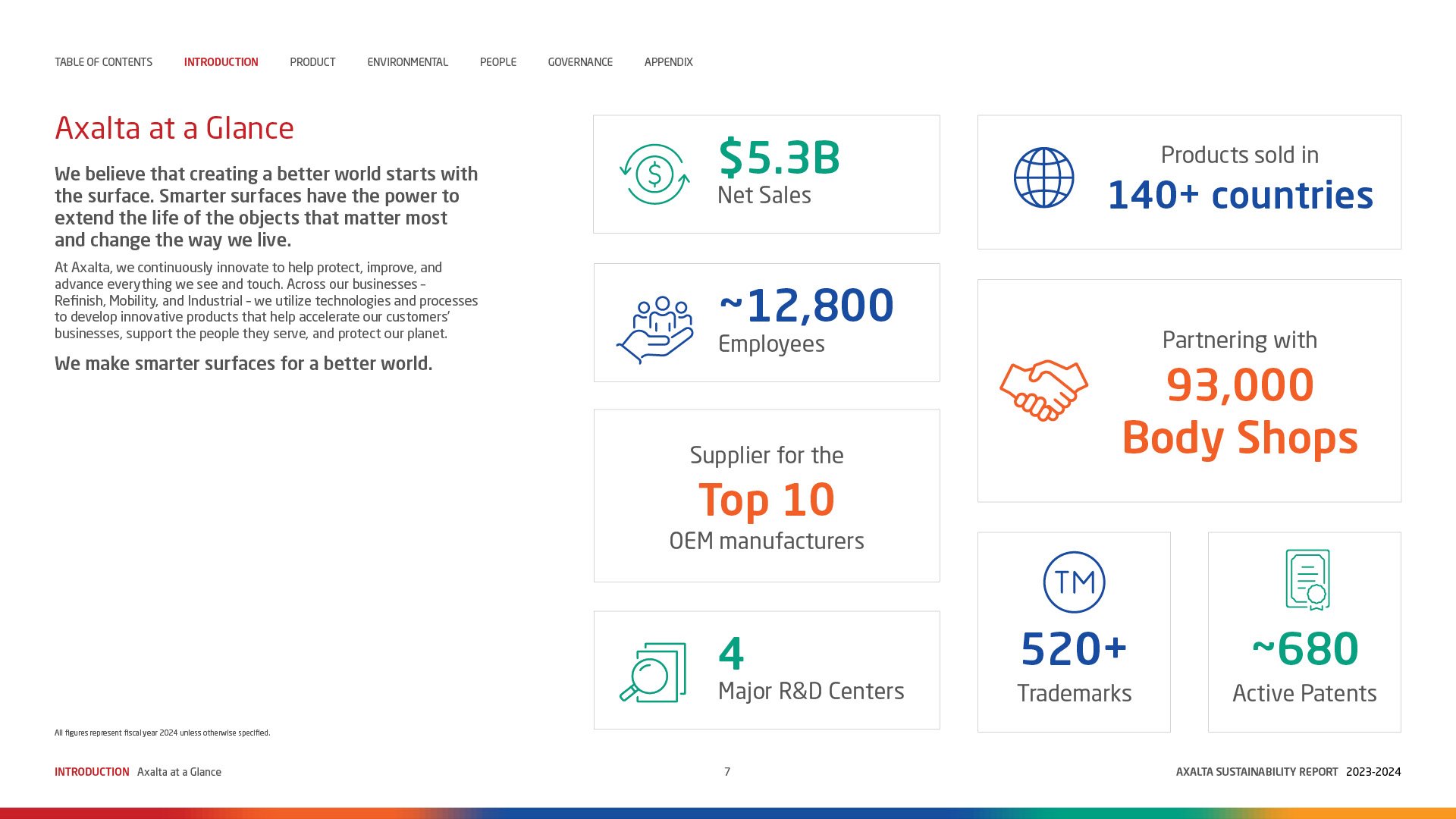
Charts, infographics, and bold data callouts give readers clear entry points into complex information. Key goals stand out, while a consistent hierarchy organizes technical tables and supporting details. Section markers and navigation cues make the publication easy to explore.
Together, these elements bring an editorial rhythm to corporate reporting, creating a cohesive reading experience that feels engaging and approachable.
Explore the full interactive report to see the design, data, and storytelling come together.